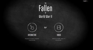
Trending on media blogs, Twitter and Facebook feeds is a 15-minute documentary on World War Two that was released on U.S. Memorial Day – titled simply “The Fallen of World War II.”
There is no celebrity voice-over, no interviews from the last surviving veterans, only the barest of archival footage. Mostly, it’s composed of bar graphs, pictograms and other statistical symbols. Yet online journalists and commentary from BuzzFeed to Slate have described it as “staggering” and “jaw-dropping.”
More importantly, many media columnists, such as Lev Grossman of Time magazine are describing it as one of the brightest examples in a new media trend: data visualization.
In a sense, data visualization is an age-old idea. The famous pie chart and bar graph were developed in the late 18th-century by Scottish jack-of-all-tradesman William Playfair as a visual aid to understanding Britain’s growing financial industry.
But “The Fallen…”, produced by Neil Halloran, applies animation and cinematic camera movement to Playfair’s statistical graphics. Halloran describes it as cinematic data visualization.
As professional communicators, we don’t get many opportunities to process and present information as compelling as World War Two. But we are frequently called upon to help audiences comprehend large numbers, like government debt. Further challenging is the fact information today can be processed and released in real time. That static pie chart doesn’t cut it anymore, so to speak.
How can animated visual data help? Going by the “The Fallen of World War II” as an example, there are some obvious differences from static print visuals.
First, the material is presented in a video player, not on static paper board or as a screen shot. There is a play/pause bar to work with, making it easier to revisit an early part of a presentation as opposed to rifling through the pages of a report binder. Additionally, this offers the viewer an opportunity to control the pace of information and even its linear nature, conveying a sense of engagement rather than a one-way flow.

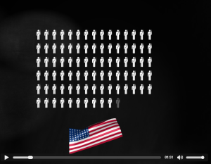
Figure 2 Tabulating the number of Americans killed in WWII. Use the pause/play bar to revisit early sections or jump ahead.
Second, the animation allows for seamless transition from chart to chart. For me, watching “The Fallen…”was like watching a continuous camera shot. I wasn’t jarred when the charts transitioned from one to another because there were no hard cuts, the same way the changing of a screen in a PowerPoint presentation would be considered a hard cut.

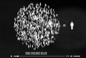
Figure 3 A visual cloud showing one pictograph represents 1,000 people. Transitions between charts were seamless.
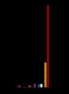
Third, there was actual dramatic tension in some of those sequences. Most viewers remembered the moment when the number of dead for the Soviet Union’s armed forces was being calculated. Pictograph after pictograph of soldiers kept being added to the bar graph while the other countries disappeared from view (one blogger in Slate article described it as a “seemingly endless parade of tiny red soldiers.” Such a sequence works by delaying the endpoint, and even the voice-narrative, and just letting the tension play out. Director Alfred Hitchcock was famous for creating suspense by delaying the inevitable.

Figure 4 This is what 8.7 million dead Soviet soldiers looks like. The most talked-about sequence in “The Fallen of WWII.”
Cinematic techniques are not the only source of data visualization. For example, how would you convey traffic patterns during Toronto’s rush hour in real time? (A street map with glowing, coloured lines indicating congested areas might work.) How about knowing where a political party’s funding is coming from? (Kickstarter is launching such a product, but only for U.S. leaders at the moment.)
New technology is bringing new methods for data visualization, and this means opportunity to experiment. This is a time to start making friends with animators, graphic artists and computer coders. They may offer the most creative, and at times surprisingly simplest solutions, to presenting information in a way that is understandable, memorable and compelling for the intended audience.
